Friday 21 October 2016

Editing - Deadpool


In this scene of Deadpool, editing is used to create excitement and suspense throughout using a variety of techniques but mostly quick straight cuts each time something happens creating the effect that is it all fast paced causing suspense. At the start of the scene we see a shot of Deadpool jumping of a bridge being followed down towards a car. There is then a straight cut to people in the car listening to cheerful music and not expecting another to happen. As we see Deadpool arrive through the roof of the car the pace of the editing changes. The faster pace the scene becomes so does the straight cuts changing to a the next person Deadpool is faced with. We get the sense of tension as we see the amount of people he is actually facing but then the mood changes to slightly more relaxed as the editing slows down due to Deadpool holding down two of the enemies. 

This doesn't last very long as when the scene shows more danger the editing of the cuts start to speed up again building the tension adds to the sense of thrill and danger. The next technique we see is when the car flips over and all the fast paced movement changes to slow motion, this has been used to focus on the gun, car lighter and chain which is all flying through the air. This causes excitement through allowing the audience to see that something is going to happen and it is going to be an unpleasent viewing. After each item passes, we it change from slow motion to completely frozen, however, Deadpool isn't and we focus on him for just a couple of seconds as we witness his sense of humour when he questions whether or not he left the stove on. This quickly jumps back into faced paced and our thoughts as an audience of what was about to happen does and we witness two people die through this. As the battle is one by Deadpool we see the fast paced scene change back to normal pace, assuming that Deadpool is now alone and all the enemies have been killed.

Thursday 20 October 2016

Lighting

3 point lighting:
This consists of 3 sectors: low key, high key and fill lighting. These are all used withing photography and filming and each have a different reason for use based on the meaning they portray to the audience. 


Low Key Lighting:
This is an element used in both photography and filming. It is mainly darkened but allows the audience to focus on one subject due to the contrast. This is mainly used when creating a dramatic or negative effect. The majority of this lighting can be seen easily in horror films. This is mainly because the effect it gives off is fear and tension that something is going to happen, however, it can also be considerably depressing and linked towards death and sorrow. This light emphasises shadow, which is what adds to the effect of suspense and terror

low key photography tutorial

High Key Lighting:
This lighting is used mainly in comedies and musicals. High key lighting is the opposite of low key, meaning the effect that it gives off isn't going to create fear and thrill but more relaxed and a more cheerful atmosphere. It is mainly used to enhance a sense of liveliness, or in dramas can also be used in dramatic scenes to emphasise the intensity of the situation. This kind of lighting is also more natural to our eyes which also adds to realism within the scene.


Image result for why is high key lighting used in films


Fill Lighting:
The purpose of this light is to lessen contrast and shadows around the subject. It may be used to reduce the contrast and appear more normal to the eye. It can be used in all films as it can give of different meanings or allow the viewer to react differently to watch they see, however, it is considerably mainly used to add to realism.

Image result for fill lighting

Filters:
Cinematographers can adjust the colour of the light by using filters. When doing this is can change and influence the effect which the scene is meant to show. 

Warmer colours such as pink and gold are likely to be used in romantic films or pleasurable ambiance, this is because of the connotations being associated with affection and compassion.

Cooler colours such as blue and grey are more appropriate for more negative mood due to connotations of both colours conveying a feeling of deep emotion and sadness.

Other colours such as red is most likely to be used to create a harsh effect as it is usually linked towards danger and death.

Other colours such as green is also considered to be a cool colour but gives of the effect of freshness, harmony or even growth. 

Wednesday 19 October 2016

Mise-en-scene anaylsis

The Sixth Sense


From this scene within the sixth sense, the mise-en-scene shown gives a lot of hidden messages about the family. For example, we see a table for two which gives the impression it is just the mother and the child who in live in the house, furthermore, as it is just a table for two it gives the idea that they are quite isolated from everyone else and don't have many people over. The idea of isolation is conveyed more by the picture which is held to the fridge by a a magnet. This gives the idea that it is a average family and the mother is proud of her son and shows this through placing a drawing (in which we assume he drew) on the fridge. However, the drawing appears to be quite empty and dull. The house is small and there are a simple tree outside which appears to be lifeless. This can add to the isolation image by portraying the idea that the area in which they live in is small, plain and boring. In addition, it can also be used to link the boy to the scene by the lifeless tree being released to the fact that this little boy is seeing dead people. Therefore, we are given the image that the little boy views himself as the only thing outside is the dead and this is what he lives with.

We also can get a feel for the family as to what they are like. As an audience we can see that they struggle with money. Through the use of the TV on a trolley it is likely to be the only one they have, so they have placed it on a trolley to make ease when moving it to different rooms. This gives the impressions that they aren't struggling as such with money since they can afford a TV, but aren't the richest people as they are having to move the one small TV they have around. Furthermore, we see the mother who appears to give off the impression of being rich or living a great life through the use of her wearing jewellery and make-up. She has red painted nails which can symbolize her femininity, or even relate to her son due to connotations of danger, blood or even anger which she is currently feeling towards her son when she believes he is lying to her. In contrast it can also be seen by other people to symbolize love which could be towards her son or someone else.

Another view we get from this scene is that everything appears to be in an unsettling or negative mood. There is little colour used within the house for example the walls are very pale yellow and even the sons clothing are muted. In addition to this, we see a TV ad displaying what appears to be a happy family full of bright colours and life which then contrasts to the current family. This creates a negative atmosphere and both the TV ad and colourless house suggest that they are unhappy the way they are or not coping. The lighting adds to this effect by being darkened which displays tension and fear, which could also link to the son having to live with the constant surrounding of dead people.

Wednesday 5 October 2016

Typography in films

Image result for guardians of the galaxy


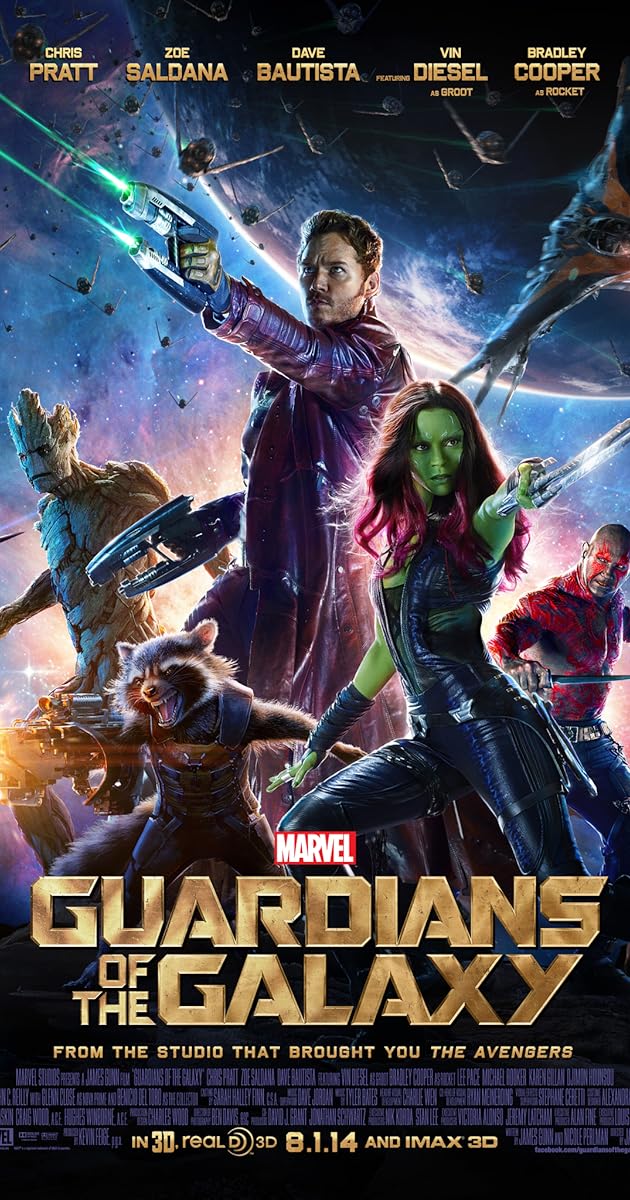
The titles in Guardians of the Galaxy are presented in bold making the title stand out. In a addition to this, there is emphasis on the Guardians and Galaxy. This could be to symbolize the setting of the film that it is focused all around the different galaxies and planets. It also gives the idea of the genre of the film as when the word galaxy is used within the title it is commonly used for Sci-Fi films. Furthermore, the focus on the word Guardians presents to idea that it is focused on heroes, linking it to another genre, action. This then links with the graphology used as we see 5 characters all ready in fighting positions like they are ready to battle. This font is slightly similar to the iconic film series of Star Wars. This can then be linked to gather the ideas of a battle between two different sides.


The effect this then has on the audience is that they will not only know the genre of the film but also get an insight into the what it is going to be like. The use of the bold focus on the guardians we as an audience are drawn in to know why they are guardians and what is going to happen. Moreover, being the guardians, the word is much bigger than the rest of the text as well as being placed above it, this suggest that they are powerful and above everything else in a way - almost unstoppable.  


The colour scheme used are the main factor of the title. It is presented in a metallic way and gold. This follows the associations of the colors and features of metal. This gives the idea that the qualities of metal being strong and almost impossible to break - comparing to the features of gold - it gives the idea that these guardians will as a team in theory be almost invincible and able to take on anything. Furthermore, the idea of using the colour gold suggests that there is going to be courage, passion and wisdom shown within the film, indicating some of the characters personalities and what they will have to go through.


Image result for dead silence


The font used is a simple font in capitals but draws in the audience due to ghostly mist appearing from each of the letters. This not only implies the genre is going to horror and thriller but it also implies the story line could contain ghosts or un-natural characters. Moreover, there has been the use of red used for less important captions. The colour red has many connotations including danger and death, with associations of blood and fire. This helps linking it to the genre of horror meaning that there could also be death included.

The title in itself draws the audience in based on the "dead silence". The word silence has negative connotations of death and sinister. As well as the word silence could possible be suggesting the meaning of death or even that it will play a key part in the film, for example, they have to stay silent or something bad will occur. This being included in a horror film coveys the idea of tension, shock and thrill. In addition, it sounds like a type of childhood game, where if you don't stay silent you will be caught, which again adds the effect of horror.

The key part of the titles is the spacing between the letters. This can be used to indicate how the characters will be bonding with one another. The effect it gives off is that the characters included no matter what their personalities are like it, they will  be defending for themselves. This can hint that each character is going to be fighting for the lives and easily be in danger.


Image result for romance films

The font used within Just The Way You Are is a simple font, using capitals and lettering pack closely together. They way this presented could be used to portray the closeness of the two characters shown,implying they could fall in love or already be in a relationship with each other. However, with some separation between the letters it could suggest there will be some sort of problem between them both along the way.

The color scheme being pink and purple is the main clue in the title as it links to the stereotype of females. This suggests that by the color alone it will fall into the romance genre and its target audience is females. The color pink has many associations including charming, romantic and universal love of oneself and of others. This links to the genre being romance and these are all key components found within romance. In addition to this, the use of purple included supports this further as it has associations of being royalty, ambition and pride. This can also suggest how the characters feel towards each other giving the impression that it is a stereotypical love story where two random characters meet, fall in love with one another. Another thing that makes this text different is it falls down on top of each other, this may be used to show that there might be a downfall or problems again throughout the film, which commonly happens in romance films but ends on a happier note

Image result for the deathly hallows 2010

The font displayed in Harry Potter focuses on his name, implying that already he is the main character and due to the boldness and extreme size of the name compared to the rest of the text, it suggests that he is some what important to the film. Moreover, the font is quite sharp which could display different meanings being that it is an action genre film and the content of the film is fast paced. It also gives of a fantasy effect which could hint towards the idea of monsters and un-human nature being included.

Another point is the colour scheme used. Both the colour scheme and font work together to create the idea of the characters shown below. They suggest that they are strong, bold and as a group, unbreakable. The use of the silver adds this effect more through the connotations being sophisticated, elegant but also loss. This can suggest that these 3 people are highly intelligent, unique and special but will sometimes have to deal with loss, whether it be one of these members or someone close as death is hinted through the title.

Sunday 2 October 2016

Cinematography

Establishing shot (ES):

This shot will show the audience the area in which the scene is taking place. It basically sets the scene for the for the audience.


Image result for establishing shot

Low Angle Shot (LAS):

This shot is commonly used in superhero films. This is because when the shot is used focusing on a certain character mainly the hero, it gives the audience the impression that they are higher in power

Image result for low angle shot joker

High Angle Shot (HAS):

Like the low angle shot, this shot is mainly used in superhero films as when focused on a character usually the victim, it portrays them as being powerless and weak. 


Image result for high angle shot

Long Shot (LS):

This shot will show the full character with some background. This usually used to show relationships between characters or a character and the setting. 

Image result for long shot

Medium Shot (MS):

Either one or two characters will be shown together from the waist upwards. These can be used when showing two people in a conversation face on to each other. It can be used to present their body language and how they feel to one another.

Image result for medium shot

Close - ups (CU):

A specific feature of a character i.e. head will be shown or part of an object. This is used to draw the audience attention towards a specific feature which may be a significant feature within a scene.


Image result for close up

Over The Shoulder (OTS):

When two characters are in conversation this shot will be used in a shot/reverse shot form. It will present two characters having a conversation whilst having both in a scene. This will allow the audience to see who is talking and who too and their reactions through facial expressions.

Image result for over the shoulder

Extreme Close UP (ECU):

This shot will focus very close up on one specific feature. This is to show extreme emotion such as fear or sadness could be to a better extent using a characters eyes. This can also lead the audience to connect with the character and sympathise or feel a certain way towards them.


Image result for extreme close up shot

Opening Scene Research

Before deciding what my opening scene was going to be, i loved at 2 different opening scenes from 2 different genres. Even though i am going to be doing my main task on horror, i wanted to focus on looking at different genres to find out why they use different shots, what they can represent in different situations, and how they gain their audiences attention. In theory these will help me plan my own opening and what shots i should use to help make my production more interesting and engaging with the audience.

Opening Scene Analysis

Jurassic Park


During Jurassic Park the audience is automatically engaged by the low angle shot camera angle of something movie around behind the trees which we cannot see much of other than a body part that appears to be taller than the surrounding trees.  This suggests that what is actually behind the trees is not only tall but can be seen as a dangerous and powerful figure. The next shot we see is a  medium close up of someone who appears to be from a working on the site who is looking upwards towards this figure in a concerned and fearful manner. This adds to the effect of making the audience want to see more and grabbing there attention in the first few seconds of the film. Furthermore, this also adds to the idea that this character is seen as threatening towards others.

Shortly after we see a long shot of another character in the middle of the crowd, the camera begins zooming in on him, suggesting that he could be a main focus or character and allows the audience to see his reaction by his body language and facial expressions as this figure is making its way towards them. The effect of this is to hopefully create more drama and tension between the what is going on in the scene and the audience watching, waiting for something to happen and to finally see what this thing is. The zooming in stops with a close up of his face and by his facial expression he appears to be almost concerned as if he has seen something like it before or has a gut feeling towards what it is. This helps support the view of the figure being dangerous as even though he may appear to know to an extent what it appears to be coming their way and is also armed with a powerful gun and multiple men, his body language displays him and feeling uneasy and afraid.

The object finally come through the trees and is a mysterious crate. As the crate comes through there is another low angle shot of this craft displayed from and long shot angle showing a group of men looking up towards the crate. This does not only present the height of the crate in the air but again creates the effect that there is something extremely dangerous and powerful and even though it is in isolation, they should still fear what awaits them. The mise-en-scene of a steel crate which in theory should be unbreakable and hard to escape from also add to the perception being that because it is in not only isolation and a big box but it also needs a strong steel crate to be keep inside. This indicated further that it’s not just powerful but vigorous and vicious.

Following this is a long take of the crate being placed down alongside the group of men. Due to the long take we get a sense of importance and as we watch the men walk and surround the box, we want them to revel more of this thing which they all seem cautious and attentive of. Due to all of the associations and ideas made for this creature, we as an audience assume that is a big deal for these men who may be less powerful and unable to contain this creature as it arrives of the ground. Furthermore, it will appear as a big deal for these men having to cope with something like this creature and therefore importance is being shown again.

We receive a point of view shot from the creature as it sounded frightened after a man opens a locked door, the creature let out a shriek and as close up this man is shown looking alarmed with almost bulging eyes. This can indicate both terror of this creature and shock due to the sudden spook of the shriek. In addition to this, the weird some which was inhumane is engaging the audience more keeping them guessing what it is exactly that is inside this crate being contained and having all of these men scared at the same time.

The very last part we see if an extreme close up of a man mouth shouting “shout her”, this is repeated twice and used to indicate how important these instructions are to be completed on that command. The audience is able to get the sense of panic, fear and anger they have towards the dinosaur and think of the men inferior to the dinosaur when it starts attacking. The last close up is of a man’s hand no longer being able to hold on. This allows the audience to sympathise with the character as it suggests that the character has just passed.  The idea that there was a death was shortly symbolised further as the shot of the hand began to fade into a new scene with silence

Opening Scene Analysis

Guardians of the Galaxy


Within Guardians of the galaxy the sound is the most crucial part. It is the very first thing presented as the scene beings, the importance of this one song playing is emphasised further as the very first shot is an extreme close up of an old Sony MP3 player, which also links to the time frame 1988. However, this is part of mise-en-scene as it shows that there is a meaning towards it but as an audience from this beginning scene we don't know what it is yet. As the film continues we find out that this song is the way that even as a young child it connected him closer to his late mother

After the close up we are introduced to the main character Peter Quill. His importance to the film is shown through the long take of him just listening to music before making a long sigh as his grandfather approached. However, we see that his grandfather also plays an important part especially in Peters life as the long shot shows his grandfather coming down to his body level for comfort. This does not only symbolise the bond between both the grandfather and Peter but also can also suggest that he is his legal guardian and shows the support he is trying to give Peter. These scene will effect the audience to sympathise with them both as they about to lose someone they both love, and most of the audience can.

As the scene progresses the next shot we see is a close up of his mothers pale blue hand straining to hand over a present. This signifies her weakness to the audience allowing them to understand her pain and position, furthermore, it allows the audience to connect with each character as we see the mother clearly unable to manage simple tasks and the family being able to do nothing but what her suffer. This could also suggest how close she is to passing and wants to be able to do this one last thing before she goes.

This is shortly followed by a medium shot of heart monitor with a long beeping sound displaying her heart has stopped, in addition, the mother is still in focus in the background but shown peacefully sleeping adding to the realism of the death. The realism is shown more in this scene as we hear the silence from other characters whilst we can hear her sons pain through him screaming for his mother. This shows strong emotion and again allows the audience to connect to Peter and sympathise for him.

As Peter is taken out the room we see a long take of him whilst the camera slowly zooms out. The way this shot is filmed can be used to symbolise how Peter feels, the further away the camera goes, the more distant he feels not only from his mother but the rest of his family, suggest he feels alone and left to defend for himself. As he beings to become frustrated and unable to cope, he runs away from the scenario. 

A wide shot is then used which shows the boy running through fog in the dark not being able to tell where he is. This immediately gives the effect that something is going the happen. Through the mise-en-scene of low key lighting and fog both having connotations of danger and fear, we begin to suspect that this event is going to become worse for Peter. This is then confirmed as a space ship flies over Peter showing the size comparison  using another wide angle shot, we see a high angle shot of him down on his knees looking up towards it. The high angle shot, indicates that he is powerless and by him being alone and vulnerable, he is then taken away. 

The scene ends on a cliff hanger making the audience want to see more which means they are now engaged to want to watch the rest of the film in order to have their questions answered. 

Saturday 1 October 2016

Codes and Conventions within film

What are codes and conventions?

Codes are shown through 3 different ways: technical (editing, sound, lighting and camera angles etc), written (speech bubbles, caption and headings - any way in which writing can be displayed on a screen) and symbolic (the way the character will behave and act to show personality traits etc. These codes are important because they give the audience an insight into what should be expected and may happen. When it comes to the opening scene, the codes and conventions are extremely important as they help to gain interest. If the audience don't feel engaged or interested during the opening scene they will most likely not watch the rest.


All these codes make up the conventions in a film, they help link the code to the genre, for example a horror film will be expected to have the symbolic codes of being based in a basement or forest etc and the technical codes of dark lighting and quick camera movements to create tension and danger.