Wednesday, 4 January 2017
Monday, 2 January 2017
Question 6 - What have your learnt about technologies from the process of constructing this product?
This is a prezi about all the different kind of hardware and software i used for both all stages of my production.
Thursday, 29 December 2016
Question 5 - How did you attract/address your audience?
This is a podcast for question 5. I was asked a few question based upon research had previously done in my research and planning and feedback i was given based upon the audience who watched it.
Tuesday, 20 December 2016
Question 4 - Who would be the audience for your media product?

Based on my textual analysis, I decide to focus my film on teenage males and the horror genre. This is because based on the results i received, it appeared to be the most common, meaning i could focus on a bigger audience rather than. This is because based on all the research we did, we found that middle class, male teenagers are the ones who most commonly watch horrors and get the best experience. Many of my target audience would already be a fan of horror films and most likely adrenaline junkies. I chose to focus mainly on these as they would mostly receive the biggest effect of a horror film. They would get the most thrill compared to older people and as it's a horror, the age rating would be higher and so many teenagers would be egar to watch one. This allowed me to focus on what would gain their interest and cause them to view it. Based on my textual analysis I was able to see how old they were and do research as to what stereotypical males of that age would do. I had also looked into what the stereotypes of horror were especially character wise. This helped me in the filming side as my target audience would not only be interested in the genre and storyline, but they might also be able to relate to the characters through there rebellious and troublesome side, as many teenage males would try to show off and want to be rebellious as it was redeemed as being 'cool'
Sunday, 18 December 2016
Saturday, 17 December 2016
Friday, 16 December 2016
Thursday, 15 December 2016
Wednesday, 14 December 2016
Production
After days of filming, I put together a rough version of the opening scene. I noticed whilst watching this that i missed a few shots from my preliminary, such as, match on action. I also noticed that some of the shots are fairly similar. In addition, due to issues with not having a tripod on some days some of the shots are shaky. However, from watching a few times, the opening does keep continuity and follows through each shot.
Due to this being the first rough cut for this, I will be making additional improvements. There is still no production company, title, and credits displayed but will need to be edited in.
Tuesday, 13 December 2016
Production Company Trial

I am currently in the production stage of using after effects to make a production company logo. I have chosen a simple design but will be animated. The design shown above is the still version of what i am currently creating and i will soon be posting the updated version. The updated version will have sound and "Filmlion Entertainment" will draw itself out. For the sound I was trying to find either a copyright version of chalk on a black board of the give the writing effect, if not i will make my own foley sound.
Monday, 12 December 2016
Filming day 4
We started filming again as prior to my opening scene research, we looked at a few more opening scenes and what they have done compared to us in order to engage with their audience. We noticed that there was quite a lot missing and what we did, didn't make much sense. Due to our recent post "production update" we did filming again for another rough cut and we want to compare the new one to other opening scenes and our first rough cuts, to see how it has developed and if there is anything missing which we can add in on our final version.
Saturday, 10 December 2016
Title production
This is the first edit for the title production. I chose the name facade as its definition is "a deceptive outward appearance". This links strongly with the story line of my film, due to it being about someone with multiple personalities. However, this is just the beginning of my title as i will need to improve it more with sound and possibly experiment more with colours and effects in order to add to the horror genre.
Friday, 9 December 2016
Production Update
After a group discussion, we decided that we needed to change our opening scene. We wanted to keep our idea, but after watching our rough cuts back, we noticed that it doesn't really show our initial idea or set the story line very well. In addition, it is very cliché in the way of the weapon we used being a knife, stereotypical characters and a clown. We are going to spend some time together today planning how we could make it better and draw up a new storyboard, we then intend to re-film a new rough cut on Tuesday and do a finalised version on Thursday.
Monday, 5 December 2016
Filming Day 3
During the 3rd day of filming i decided to do very similar shots, however, this time i used a different car as stated before. We reshoot every single shot from before as we broke continuity and the 180 degree rule. However, we made a rough cut and the footage we received from this shooting will be used for another one as we decided to use a bigger variety of shots. There was a problem with filming due to not having a tripod so having to hand hold the camera mad our shots more shaky, but we worked our way around it. In addition to this, one of the main characters we needed (clown) wasn't able to help out so another brother had to step in. Overall, the filming today was successful and we got quite a lot done in a amount of time.
Thursday, 1 December 2016
Creating Foley sounds
After previous research into Foley artists, i decided to have a go at trying to make some sounds which could add a greater effect to our production company and may also be used in our opening scene. I went around our school (Nene Park Academy) in search of equipment
Filming Day 2
I decided that i would like to redo some of the footage from last night. I thought about the type of car we used which was an old, pale purple Suzuki, i thought using a red car would be better due to red implying danger which would fit the image more. This was an easy part to film as there was only a rough section which would need to be redone. We went back to the same location and re shot the little part where you could see the colour and type of car as the interior looked pretty much the same and would help with the continuity.
Wednesday, 30 November 2016
Filming Day 1
During the first day of filming, i decided it would be best to do a rough shot of what we would do. I thought it would be best to do this so i could get a rough idea of how it could be improved and the different shots i could use to give a different image. The first day of shooting was successful and took roughly an hour. There was some problems as whilst i chose a location which was isolated, someone had passed during the filming and stated they were concerned after the recent news about killer clowns. Although after we explain it was for media school work, they seemed happy enough to let us continue. The footage i got seems okay, however, when it comes to editing i might need to re shoot some of it.
Monday, 28 November 2016
Recce
Recce from charlie1901
This is the recce document. A recce is a pre-filming or pre-photography visit to a location in which we intend to use. The purpose of doing this is so that we can get an understanding of the suitability of the location and consider why it is or won't be useable for our main production due to sound, lighting and accessibility etc.
Sunday, 27 November 2016
Model Release Form
These are the model release forms from everyone we would need to help act in our opening. On these forms it states their names, address, contact number, the date of the signature and most importantly the contract in which they are agreeing to and their signature as proof to this. This document is essential as it giving us legal permission to post our footage on social media such as YouTube for educational purposes. Everyone that was involved must sign this not matter what otherwise we are unable to use footage with them included.
The contract states:
I hereby give Charlie Brett and James Harbour, the irrevocable and unrestricted right to use and publish video footage or photographs of me that are taken on the above date. These may be used for educational purposes (that may include publishing to a public video forum, such as YouTube or a blog), film production or advertising.
All 3 people (Morgan Granger, Harvey Brett and Luke Brett) were aware that when signing the document that the filming would be on going and all the footage taken on this date and further dates will be used. They all gave us consent to use it and were happy to continue helping to act in our opening.
Friday, 25 November 2016
Production company design

Mindpix Entertainment:
We choose Mindpix entertainment based upon the theme of our film. Our idea was linked into dreams and psychological disorders, which is all to do with the mind. This hints to the audience that the genre could be linked to horror due to a vast majority of films in that genre involving some sort of mental disorder. In addition to this, we used the image of a brain in someones hands almost representing that they are in control of their mind, when in reality of our film, they feel that way but actually aren't. This again links to horror because it shows that they are not aware of their actions and anything can happen due to this. Moreover, the main colour is blue. We chose this colour because of the association of depth and stability in which our character does not have. It can be used to symbolise intelligence ( which our character will be), trust (this linking to our character needing to trust people around him but have people trust what he says as well), and lastly heaven ( this being linked to death where our character will die in the end). Blue is also considered to be beneficial to the mind and body.

Uniflix Studios:
We choose Uniflix Studios based upon the colour scheme. The colour scheme is simply black and white. The colour black has connotations of power (our character will be powerless compared to the enemy he comes face to face to), death (our character will witness his death a variety of times until it eventually happens), and mystery ( this being because no one will know who the antagonist is or why he is doing what he is doing). Furthermore, black is a mysterious colour usually associated with fear and the unknown and can also be associated with darkness, these are all key themes within a horror film. This being compared to the colour white which has more positive connotations being safety ( our character constantly still believing it was just a dream and is safe), innocence (he has done nothing to lead to his murder) and light (could be linked to a symbol of hope). However, the two colours working together, with black being the main colour over white it can suggest that evil is superior to good. This can then link into the horror genre showing the binary opposites good vs evil etc which are common in horror. Lastly, we gave hints as to who our target are based on the word "uni" being in the name. We choose this because our target audience is ages 15-21 year olds, with the majority of these being in the age section for finishing school and most will be going to uni.
Animatic
This is the animatic for our main task. We turned the storyboard into a short animation to see if the opening would flow and make sense. By doing this it allowed us to watch our story board and see it come to life, in theory by doing this we could see how it would look as an overview of our opening and if
Storyboard for main task

Shot 1
Shot Type: Long Shot
Visuals: Car, Fields, Dark
Sound: N/A
Dislogue: N/A
Shot 2
Shot Type: Long Shot
Visuals: Boy, Underpass, Hoodie
Sound: N/A
Dialogue: N/A
Shot 3
Shot Type: Close Up
Visuals: Phone, Hoodie
Sound: N/A
Dialogue: N/A
Shot 4
Shot Type: Long Shot
Visuals: Clown, Mask, Weapon
Sound: N/A
Dialogue: N/A
Shot 5
Shot Type: Wide shot
Visuals: Smashed Phone, Dark
Sound: N/A
Dialogue: N/A
Shot 6
Shot Type: High Angle Shot
Visuals: Dead Body, Weapon, Clown
Sound: N/A
Dialogue: N/A
This is the story board for our main task. This is a rough overview on what we want to do and the order. By doing this we could choose what would look best and design what could be displayed in our opening scene based upon our idea. By looking at this, we are happy with the order and shots chosen, however, we will be turning this into an animatic to see if it flows when being watched and if we should add anything in or change something in order to look better. An updated storyboard may then be produced due to any changes.
Sunday, 13 November 2016
Locations
For our locations, we decided that we would base it only in 2 locations, the first being a pathway and the second being an underpass.

We choose the pathway because it helps add to establish the setting. From the pathway we could see that he is in the middle of nowhere and that he is in isolation in a fielded area where no one can hear him or help him if he needs it. This in theory should help us with the danger theme we want to show. in addition, the street light also helped create a more natural light for us when we filmed in the dark.
 The underpass we used was local and after consideration of looking other places, we thought this would be the best. We decided to use this location due to it being more isolated, had lights which made it easier for us filming in the dark. Furthermore, we liked the street art which was displayed all over the underpass and whilst we considered that there might be continuity errors when filming, we still thought we could resolve the issue. We choose this area because the art helped add to the idea of the character. This being that it is considered a thing a gang would do or a type of criminal, which will help as we wanted to display our main character to be involved with that type of people. This associated more with his clothing. Moreover, it also adds to the idea of isolation and danger as it is a place where crime can easily be found, and suspense can easily be added by allowing the audience to guess what awaits him on the other side.
Group Update
Due to struggling to get all the film work and editing achieved, i asked James to help out. However, due to him having a very similar idea to mine and has helped out a lot with the work i had done, we decided to would be fair to take half the credit each and work together in order to achieve a better finished project.
Costume and Props

Based on the recent craze of the killer clowns, we based our initial idea on them. We thought that we should hint our genre through the colours we use and to that, we wanted to stick to the use of dark colours with meanings of danger. We decided to go with a jester instead of a clown because it was slightly different and considered to be more of a joker character. In addition to this, we wanted to include a mask like the one shown or face paint so the antagonists identity is covered.
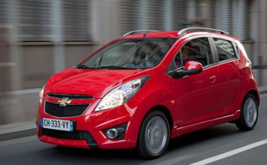
Car:
We decided that with the car, it would be a good idea to pick something most people our age would drive, as that is the age we are basing our main character to be. We thought that due to our whole idea of the colour scheme hinting towards danger, a red car would be the best choice. In addition to this, we wanted to drop hint to the audience and show what the characters personality was like. We wanted use a car that had a sporty look to some extent, but also red to show danger. We thought that the too of these working together would help represent the character as a normal teenage boy, who has both strength and power. We decided that based on the car "Chevrolet Spark" (The car shown in the picture) being available to us to use, that it would help do what we wanted.

Knife:
We thought that in order to make the jester look more sinister we should include a weapon. Moreover, giving the antagonist a weapon, whilst the protagonist doesn't have anything shows how he is already in an advantage and superior. We did some research into what weapons are commonly used in horror films and we found out that it is mostly penetrative and so because of that we thought a knife/dagger would help us link our opening to the genre. However, after consideration we thought that a knife might not be the best idea and may consider choosing a different weapon such as a baseball bat, which will work just as well but be different from most horrors.
Teenager clothing:

We wanted the protagonist to look like an average teenage boy. When thinking of teenage boys stereotypically they are seen as rebellious, careless and chavvy. We wanted to peruse this look and based on our research into what "chavs" would usually dress like, we found an image that would help us (on the right). Based on the image, we decided to dress our character in a track suit and trainers. Furthermore, we found the most common brand in which they wear are Adidas, so this might come in handy later on. Moreover, we choose this look because being stereotypically they look like someone you would want to stay away from, due to associations with gangs and being trouble makers. This might help with our opening scene having seen the teenager come face to face with the antagonist, this could be a background reason why.
Monday, 7 November 2016
Additional Research
Before i planned my film opening properly i wanted to look at what peoples primal fears where so i could try to include that in the opening in order to create a sense of fear earlier on. I decided to look at the most common phobias as when making a horror the best way to create the sense of thrill is to act on someones primal fears.
I found that the top 10 fears in which i could include in my opening are:
- Fear of heights
- Fear of the dark
- Fear of death
- Fear of Spiders
- Fear of clowns
- Fear of thunder and lighting
- Fear of enclosed spaces
- Fear of dolls
- Fear of blood
- Fear of dogs
Most of the phobias above are used commonly in horrors especially the dark as it helps add to the effort of negativity and danger. When it comes to making my film, including most of these phobias will mean that it will be a thrilling experience for more than one specific audience.
In addition to phobias, i found that a common one was clowns and as i wanted to base the opening around clowns, i decided to look at the top clown horror movies. By doing this i can see how the character is presented and how i can try to present a clown in order to create the same effect.
Top 5 scariest clowns:
- Pennywise - IT (1990)
- Billy - Saw (2004)
- Happy Slappy - Air Bud (1997)
- Pogo The Clown - Gacy (2003)
- Horny The Clown - Drive Thru (2007)


Idea Update
After being told by Thorpe Wood police station that it wouldn't be possible for me to film there and currently struggling to find a place to film the other scene i need, i decided that it would be easier to change the idea. I decided to focus on the new craze of the killer clowns as it was an easier option to film, find locations and props as well as being considerably quick to put together based on the time remaining.
Below is the new idea in which i soon going to film.
Killer clowns from charlie1901
Location Update - Thorpe Wood
I've have requested if i can film in the local police station Thorpe Wood. However, i have been informed that i will be unable to do this, therefore i will either have to find and request to film in a similar area or have to change this idea of the film.
Title Design And Name
For our film we needed to decide on both the name and font for the film. We decided to look at different websites to get ideas. The main website We used was www.1001fonts.com, which let us experiment with different fonts, size and colour schemes to decide what would look best. However, decide the colour scheme would be focused on the colour red to hint the idea of danger and thrill linking the horror genre.
This are some of the designs i looked at:

However, this is the final design i have chosen:

I choose this design because it looks like it has been written by someone and adds to a hunted effect. I chose to use capital letters simply because it stands out more and adds to the colour giving the implied impression of danger.
Cast and Roles - opening scene
For our opening we had to try and find people who were able to help us film the parts we needed but since we only really needed two people for the cast, one being the main character (Father) and the other being the voice over (Son). I tried to find people who would also benefit from helping me.
Main Character: Luke Brett
Son(voice - over): Harvey Brett
Make Up: Stephanie Pearson
Music: Callum Hughes
Music: Callum Hughes
Camera: Charlie Brett
Editing: Charlie Brett
I asked both my brothers to help with the acting and voice over as they are both interested or currently studying drama. I also asked my friend who is studying media make up to help me as it gives her a chance to try something different. Lastly i asked my friend Callum to help with music due to him being a music student and also means we will have original music, however, we are still waiting for confirmation.
Script for main task
We decided that we should start planning the script for our opening. This is our first rough draft.
The opening scene will be a monologue of the child telling his dads story of to how he got to where he is.
The opening scene will be a monologue of the child telling his dads story of to how he got to where he is.
(Sound of prison door shutting)
(Pan around man with head bowed between his knees)
(Pan around man with head bowed between his knees)
monologue:
(child crying – dad reacting to it as shown in film)
My daddy isn’t evil, he didn’t do a back thing he’s just miss understood.
Daddy can’t help the way he is, he gets stressed.
He used to be okay, but then he was told he had a mental disorder, he can’t help when he changes.
Daddy mean to get stressed that night
But now daddy is different, daddy feels bad for what happened but he also is happy and laughs about it
He now loses his mind when he thinks he can hear me
But I love driving him crazy like that
The truth is I like haunting my daddy
He shouldn’t have killed me
(child’s laugh as fades to titles)
Problem During Planning
During the planning progress of our production, i found working as a group even a small one became a problem. As the other half of the group was having a few problems keeping up to date with the planning progress, unable to help and keep up with the work provided in order to start the filming, i decide that it would be easier for both of us to work at our own pace and create two different film openings. Furthermore, we also had a different view on what to do for the opening scene such as the title, locations and storyline, it gives us both the chance to make our initial ideas.
Production Company Logo Research
Before i design my own production company, i need to do some research into what different logos each company has. This can include the colour scheme, if it is simple and basic or full of detail and what picture are included if any etc. This research will help me when it comes to planning my own logo as i can be influenced by how they use their logos to connect with their target audiences and what they do to give off a certain image.
 Walt Disney
This a major production company, which is mostly known for its work in children's films and animation. The logo in itself is a simple image of a castle with the outline of where a star passed over it. The use of the image is implying to the audience that they own magical, fantasy and films containing royalty mainly - they mainly create princess films such as "Tangled", "Frozen" and "Sleeping Beauty". In addition to this, there is the use of the font in walt disney standing out and can also be recognized by the theme park resort Disney Land. The font used is a fun and fancy looking which should gain the interest of younger children compared to being written in simpler and more basic font such as "WALT DISNEY".
 Film 4
This is an independent production company, which releases a variety of different films which is why unlike Disney it doesn't have a specific picture linking to its common films. The films released are based from all different genres, however, the content of the films will most likely be some form of drama, crime or thriller and therefore aimed towards the older generation, hence there being nothing too fancy on the logo. It colour scheme is a basic and simple red and white, nothing to fancy. Due to the contrasting colours being white on a bright red, it stands out drawing attention into the company. and It is mostly known based from the TV channel rather than being as a professional film company. They have released films such as "Amy", "20,000 Days On Earth" and "Under The Skin". These kinds of films are not the most popular, and will not be released in cinemas like Walt Disney films would, in addition, nor would they be released world wide as they're target audience is very narrow.

DreamWorks Animation
This is another major film company. They have released similar films to Walt Disney as they are mainly aiming films towards the younger generation. They have used a similar idea to their logo, they have used a small child sitting on a moon in the sky whilst holding a fishing rod. This can suggest that it is full of imagine and based upon dreams in which the child on the moon is dreaming of. In addition to this, it works alongside the colour scheme as it is full of colour in which all young children will notice more, compared to the film 4 logo. Therefore, when a child sees the logo they may be encouraged more to watch it as the colour will stand out to them. They have released films such as "Shrek", "Kung Fu Panda" and "Over The Hedge".
Warner Bros - Changed Logos

One of the main thing for production companies is to update their logo as when technology is being more advanced they can make their logos more appealing and stand out more. Warner Bros is a major film company which has the rights to many big name films such as "Batman V Superman: Dawn Of Justice", "Harry Potter And The Deathly Hallows" and "Superman: Man Of Steel". By looking at this,i can see that when they first started the logo looked interesting and for the time in which it was first made it was quite advanced. However, 6 years later they had changed their logo completely which could be to stand out more and give off a different meaning. This lasted 5 years before going back to their original idea which was constantly being improved adding more colour and effects gaining more interest and more recognition when a film was released at this was shown. After 75 years they updated their logo to show how long they had been running for and obviously appears as quite successful to have continued this long. This remains the present logo in bold colours and sharp looking characters. By looking at the new logo they have used a lot of bright colours suggesting that their films are engaging, exciting and can be a family film. In addition, they have used a lot of gold implying luxury, magic and courage which will be displayed in almost all of their released films.
Location - thorpe wood
In order to film one of our scene, we needed an area which was or looked relatively similar to a prison cell. I went into our local police station (Thorpe Wood) and asked if it was a possibility that we would be able to film in an empty cell for approximately an hour just for a school media project. I was told that the officer there on the day couldn't give me any permission, however, she could find out for me if i went back in a few days.
Initial Idea
This is our presentation for our main idea. In this presentation it states the outline of our idea, the shots we would like to use, the props and setting and the lighting. This is all a basic idea which will be worked on more. We did a mood board and looked at films that are in the genre of horror, crime and thriller as it linked more towards our idea and also helped give us to improve our initial thought. They also helped when planning our script, the shinning was the most useful for this as both our film and the shinning are about psychopaths. However, we decide to make our film a different by using the main characters dead son tell his story to how he got to where he is.
coming up with ideas
As a group me and Nayma came up with a few different ideas based on the horror genre. One of which we will develop into our main idea. Nayma wanted to base our initial idea based on ghosts from idea such as Paranormal Activity and Insidious, however, i liked the idea of doing a film based on a psychopath with mixed personalities.We decide that they could both work together by using the ghost being the reason the main character is a psychopath.
A brief summary of our film which will be developed further is:
A man who has mixed personalities thinking he is a different person accidentally killed his son. He soon begins to hear voices engaging him to act out in different situations, whilst also thinking he is seeing his dead son.
Research into potential target audience - Primary Research Results
I sent out a questionnaire to find out more about who my main target audience would be. I was able to see what kind of films they like, why they would watch a film, and what is important to them in an opening scene. This will then help me when it comes to creating my own idea to look for what i can include, and what to focus on more. I posted the questionnaire on social media i.e. Facebook and was sent around my parents workplace. I decide to share this questionnaire where i wouldn't just have my friends opinions as they will most likely be the same and i wanted to get a more diverse view. I received 31 results all from different age groups and backgrounds, giving me a wider variety and idea on what people like.
Question 1: Are you male or female?

Based on this question i was able to see that there was an almost equal divide between the males and females who answered my questionnaire. This will allow me to see if stereotypes show based on genre and interests and will also give me an idea on how i gain the attention of both genders to watch the film.
Question 2: What is your age?
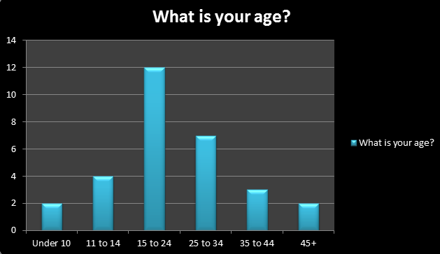
This question helps me because it is clear that the majority of people who answered are aged between 15-24. This will help me as it means this is what i should focus on for my target audience. However, i can also compare this to the people aged between 25-34 as there wasn't a big difference in the amount of people who answered. In addition, due to there being very limited results from the under 10's and over 45's , it was evident that i should rule these out from being a target audience.
Question 3: What is your favourite genre?

By asking this question i was able to see the most popular genre which i can then focus on for my film. The most common genre was horror, followed by action and thriller. This will help me majorly when planning my film as my initial idea was based in the horror genre, but i can now try to gain more popularity by including ideas which can link to both action and thriller. However, most horror films will include thriller and action content. In addition, this will help me further as based on prior research i found out that most 15-24 year olds will view horror as their favourite genre. Whilst this is stereotypical, it means this will be my main target audience.
Question 4: What makes you want to watch a film?
The responses i got back included: "good review", "the trailer is eye catching", "been recommend to them", "favourite actors included" and one of the most common responses being "the title is intriguing". When is comes to preparing my film opening i will need to think about all these comments, and based on the most common answer revolving around the title, this will have to be a main focus. Furthermore, i will focus on the other comments by looking into trailers for different films and film reviews to see if any can help influence my film content.
Question 5: What is your favourite film?
The responses included: "Suicide Squad", "Deadpool", "Saw", "The Ring", "Schindler's List", "Cabin In The Woods", and "Divergent". These films come from a variety of genres however, they all involve some sort of action at some point meaning that tension will be created, which is something i will need to include within my opening. Through being given these titles i am able to watch clips and trailers which will enable me to view how they create this effect in different scenes. I can also look at reviews and compare to good from bad, this will then help me as i can be influenced by what they have done or know to avoid making similar mistakes in my film opening, such as story line doesn't flow.
Question 6: How often do you watch films?

The results i got from this shows that the most common answer was to see how many people are likely to watch films. By asking this question, i found out that most people watch films a few times a week. The results i got shows that the majority of people who answered commonly watch films. This would show if films are popular compared to TV programmes. In addition, it means that i could look at the results from those who said they watched films more than once a month to everyday as they will most likely be the ones who love films, and therefore be my target audience.
Question 7: What attracts you to a films?
The results i received included: "actors", "good reviews", "good trailer", "good title name" and "good plot". Due to most of these being repeated, it shows that these are a common things people look for before going to watch a film. Therefore, I should try to included as many of these in mine as I can. Based on these results, my initial idea must be able to have a good story line and be engaging with the audience. I can ask a further question later on to see if the storyline does actually engages with an audience or not. Furthermore, will have to make sure that when it comes to making the main task it looks professional with the actors used as well as having a suitable title.
Question 8: Would the actors included make you more likely to watch a film?
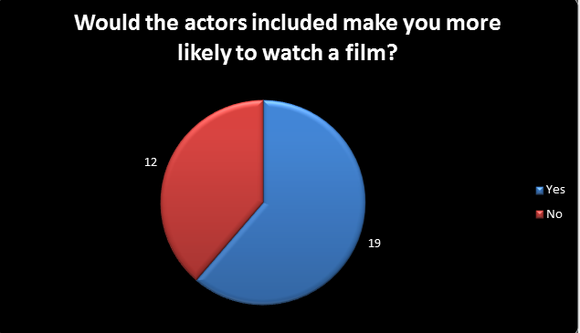
The was an important question to ask, from this i will find out if the people i ask to play parts in my film will make a difference to whether or not they will watch a film. For example when it comes to films i can gain interested from different people based on the actors. Most women seem to be drawn to watch a film based on appearance of a character such as an attractive male. Therefore, it could be a way in which i can reach a bigger target audience, by focusing on engaging with different genders and audiences from what I include. In addition, the people who I ask to play a role should be able to act well in order for it to be successful at the end. By looking at the results, it is clear that to most people it does matter who the actors are in a film, so will need to be taken highly into consideration in order to reach a bigger audience.
Question 9: Would the production companies influence you to watch a film?
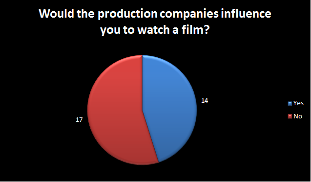
This question was essential as most companies such as "Disney", "Pixar" and "Warner Bros". I can attract people to watch their films by having a world known brand. When people know the production company it can sometimes help gain more people to watch a film, even if its not one they would usually go for, mainly due to the type of films they create. From my results it suggests that the production company is an important factor to some, however, it isn't the most common thing to interest people to watch a film compared to other factors.
Question 10: How likely are you to watch a film based on the opening scene?
The majority of people who answered said 7/10 times and plus implying that if the opening scene isn't any good nor does it engage with them to continue watching, they wont watch the rest of the film. It suggests that the opening sets how the rest of the film is going to be, so bad opening means the rest of the film will be too. This will in turn encourage me to try and show the codes and conventions genre of horror more, included better filming techniques as well as effects when it comes to credits and titles to engage with people in different ways and look professional.
Question 11: What is the most important feature of a film opening to you?
In order to help me achieve question 10, i asked this question so i would know how different people are drawn into an opening. Many people stated that "it has to look interesting and eye catching" which will be a main focus and will try to be added more not only by the cinematography but also by the use of the program After Effects to create more exciting credits that can also add to the genre using a ghostly smoke effect. In addition, some others said "sets the story line" being that the opening has to show what the film is about and initially who the main character is. This is so it is easier to follow and they have a basic understanding allowing the rest to make more sense. This will help when it comes to my opening scene as i will be making sure that i show the genre is horror and has the dangerous and thrilling side of it in the opening scene engaging them within the first couples of minutes and hopefully cause them to want to see more.
Subscribe to:
Posts (Atom)