Mindpix Entertainment:
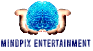
We choose Mindpix entertainment based upon the theme of our film. Our idea was linked into dreams and psychological disorders, which is all to do with the mind. This hints to the audience that the genre could be linked to horror due to a vast majority of films in that genre involving some sort of mental disorder. In addition to this, we used the image of a brain in someones hands almost representing that they are in control of their mind, when in reality of our film, they feel that way but actually aren't. This again links to horror because it shows that they are not aware of their actions and anything can happen due to this. Moreover, the main colour is blue. We chose this colour because of the association of depth and stability in which our character does not have. It can be used to symbolise intelligence ( which our character will be), trust (this linking to our character needing to trust people around him but have people trust what he says as well), and lastly heaven ( this being linked to death where our character will die in the end). Blue is also considered to be beneficial to the mind and body.

Uniflix Studios:
We choose Uniflix Studios based upon the colour scheme. The colour scheme is simply black and white. The colour black has connotations of power (our character will be powerless compared to the enemy he comes face to face to), death (our character will witness his death a variety of times until it eventually happens), and mystery ( this being because no one will know who the antagonist is or why he is doing what he is doing). Furthermore, black is a mysterious colour usually associated with fear and the unknown and can also be associated with darkness, these are all key themes within a horror film. This being compared to the colour white which has more positive connotations being safety ( our character constantly still believing it was just a dream and is safe), innocence (he has done nothing to lead to his murder) and light (could be linked to a symbol of hope). However, the two colours working together, with black being the main colour over white it can suggest that evil is superior to good. This can then link into the horror genre showing the binary opposites good vs evil etc which are common in horror. Lastly, we gave hints as to who our target are based on the word "uni" being in the name. We choose this because our target audience is ages 15-21 year olds, with the majority of these being in the age section for finishing school and most will be going to uni.
No comments:
Post a Comment